My Favourite Video Game Easter Egg

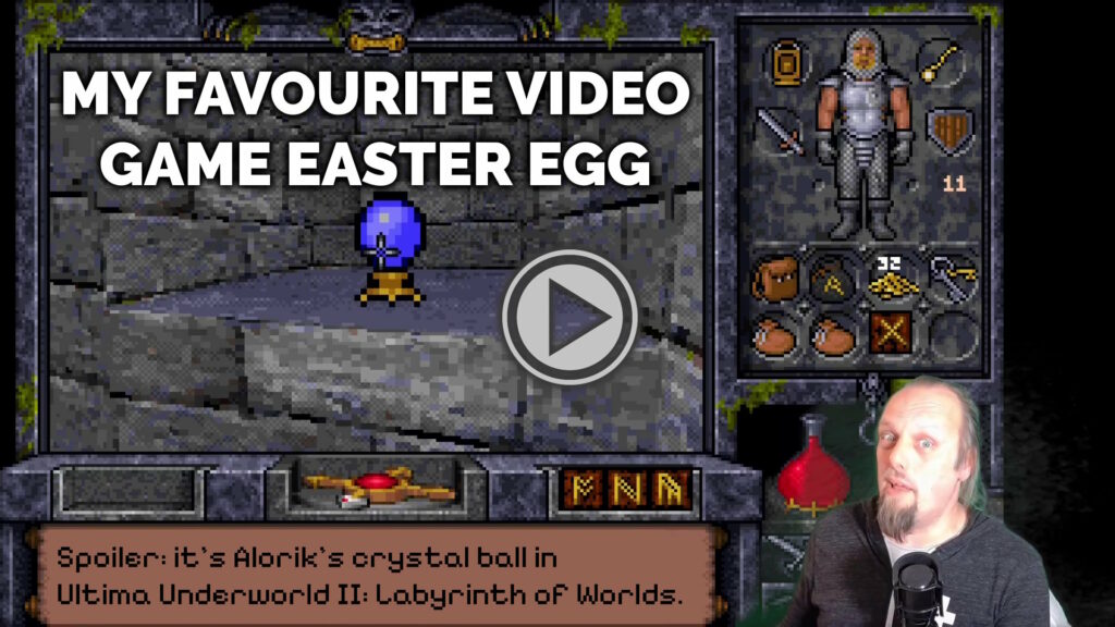
Spoiler: it’s Alorik’s crystal ball in Ultima Underworld II.

This blog post is also available as a vlog: why not watch & listen to me as I demonstrate my favourite video game Easter egg!

Video preview showing Dan overlaid on a screenshot of Ultima Underworld II.

Ultima Underworld II

My favourite video game Easter egg is found in Ultima Underworld II: Labyrinth of Worlds1.

Released early in 1993 after missing a target of Christmas 19922, it undersold despite being almost universally well-received by reviewers3.

Composite of PC Zone's review of Ultima Underworld II, overlaid with their final score: "94%: Just go out now and buy it, okay."
I don’t know how print magazine video game reviews read today, but back in the early 90s they seemed to be frivolous and flippant approximately 100% of the time.

Developed by Looking Glass Technologies, it used an enhanced version of the engine they’d used for the game’s prequel a year earlier4.

The engine is particularly cool for it’s time; it’s sometimes compared to Wolfenstein5, but that’s not entirely fair… on Wolfenstein! The original version of Underworld‘s 3D engine predated Wolfenstein… and yet supported several features that Wolfenstein lacked, like the ability for the player to look up and down and jump over chasms, for example.

Screenshots of the same piles of bones and detritus in Ultima Underworld I, seen from two different angles.
Move around and you’ll see the 3D walls shift to your new perspective, but you’ll always see the same side of the 2D objects on the floor. Turn as you might, you’ll never see the back of that skull!

The team’s expertise and code would eventually be used to produce System Shock in 1994. The team’s producer, Warren Spector, would eventually draw from his experience of the Ultima Underworld games when he went on to make Thief: The Dark Project and Deus Ex.

But the technology of Ultima Underworld II and its prequel aren’t as interesting as its approach to storytelling and gameplay. They’re:

  • real-time
  • first-person
  • non-linear
  • fantasy roleplaying games

This was a highly innovative combination6.

Highlighted part of the Designers Notes, reading: "We feel that one of Underworld’s strongest features is its capacity to generate situations and strategies that we did not script, but that arose from the scenarios we created. For example: Suppose there’s a Despoiler daemon guarding the key to that door. Maybe I should come back when I can take him hand-to-hand … or bring up my picklock skill … or throw this sling stone at him, see if he’ll chase me … or maybe I can sneak past him — how good is a Despoiler’s eyesight? And can he swim …"
Underworld II encourages lateral thinking and provides multiple solutions to many challenges, perhaps best-described by this section in the Designers’ Notes page at the back of the manual.

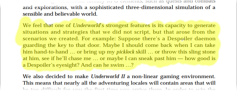
What’s being described there is what we’d now call emergent gameplay, and while it wasn’t completely new in 19937 it was still uncommon enough to be noteworthy.

The Easter Egg

The Ultima series are riddled with Easter eggs, but my favourite is one that I feel is well-hidden, beautiful… and heavily laden with both fan service and foreshadowing!

Screenshot showing a frozen fountain in an icy realm.
The third of the interdimensional planes the Avatar visits in the game contains a city frozen solid by the Guardian’s magic.

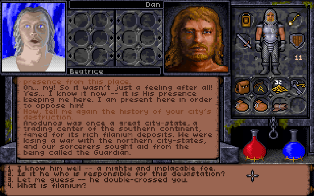
To find the Easter egg, you must first travel to Anodunos. This city was once the capital of a tropical city-state which had become allied to the Guardian, the the principal antagonist of Ultima VII through IX.

Box art showing a hero dressed in leather armour wielding a staff with a glowing tip in a frozen cave.
The original box art for Underworld II, painted by Denis Loubet (who’ll draw your RPG character for you if you like!) showed the Avatar in the ice cavern, wielding an important late-game artefact.

After the city’s major, Beatrice, attempted to put an end to the red titan’s growing demands, the Guardian cursed the city fountain to radiate out a magical cold that eventually froze the entire settlement under a cave of ice.

Screenshot of the conversation interface as Dan talks to a ghost called Beatrice.
Mayor Beatrice lives on here, as a ghost. While she’s a great source of information about the ice caverns as a whole and has information highly useful to the primary quest, that’s not the thing we’re interested in right now.

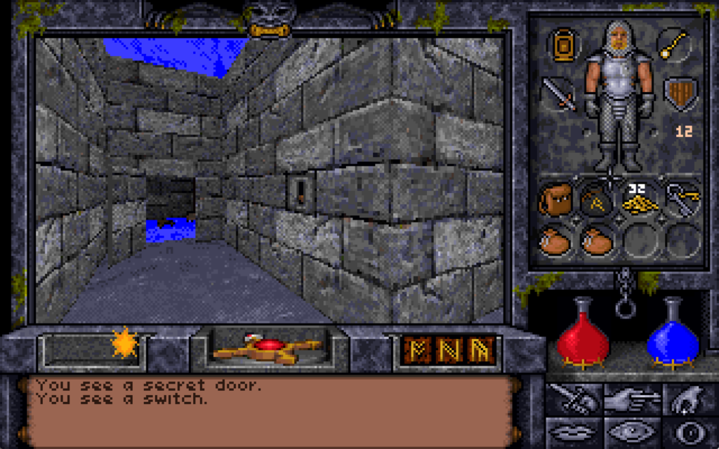
On the Eastern bank of the city’s river we find the remnants of the workshop of the magician Alorik, and in it – if we look in the right place8 – a secret door. We can’t open it though: unusually for a secret door in this game, it’s locked.

Looking at a blank patch of wall in a frozen room, the player is told "You see a secret door."
In the original, unpatched release of the game, you couldn’t even cast the “open” spell on it to unlock it: the only way through was to use a powerful late-game spell like “portal” to teleport to the other side.

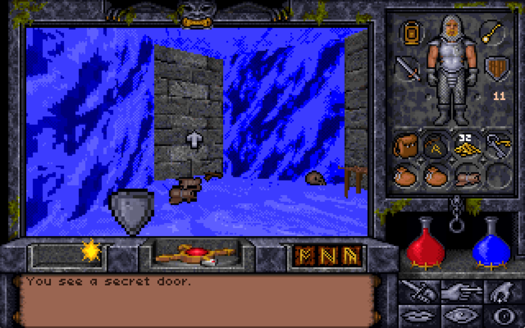
I didn’t even find this chamber on my first playthrough of the game. It was only on my second, while using the Map Area spell to help me to draw accurate maps of the entire game world, that I found the room… and even then I spent some time hunting for a switch on the “outside” before eventually giving up and teleporting into the secret room.

An open secret door (the one from before, but viewed from the other side), and a thrown switch.
Once you’re on the other side, there’s a switch. I guess it’s a Alorik’s panic room?

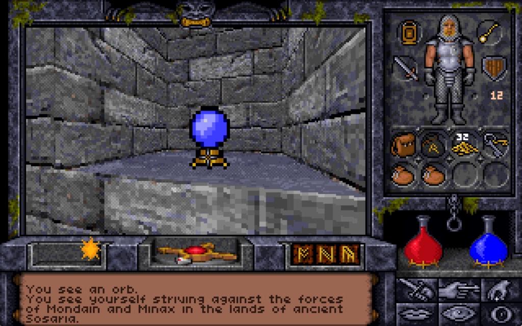
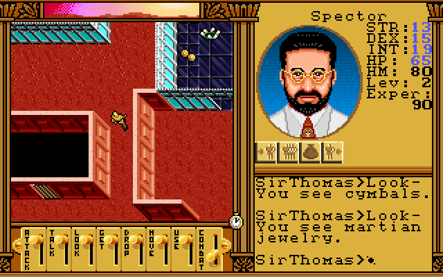
There’s valuable treasure here including a sceptre of mana restoration, a “grav” runestone (probably still easier to get than the one at the Scintillus Academy), but what’s most interesting is the crystal ball, which the player can look into to see a vision of another place and, in the case of this orb, another time.

The first time you look into it, you’re told:

You see yourself striving against the forces of Mondain and Minax in the lands of ancient Sosaria.9

Mondain and Minax are the antagonists in Ultima I and Ultima II. We’re seeing the earliest parts of the player character’s adventures.

In the game: looking into the crystal ball.
It’s long been argued that the “Stranger” – the protagonist of Ultima I through Ultima III – is a different person to the Avatar of Ultima IV but I feel like this vision is canonical proof that they’re supposed to be interpreted as being the same person…

If we look into the crystal ball a second time:

You see yourself climbing to the peak of Olympus Mons on the planet Mars.

This is a reference to the plot of Ultima: Worlds of Adventure 2: Martian Dreams… which is a… weird choice of game to reference.

In my mind, a more logical leap forward in time might have been to jump to Ultima IV10, in which the protagonist first becomes the Avatar of the Eight Virtues and the Hero of Britannia. Martian Dreams is… a sequel to a spinoff of Ultima VI. So why pick that?

Screenshot from Martian Dreams showing Dr. Spector.
Little-known and oft-forgotten, Martian Dreams is apparently nonetheless a source of pride for the real Spector.

Martian Dreams starts with a friend of the Avatar’s from Earth facilitating the Avatar and their companions to set out on an adventure to the planet Mars. That friend is called Dr. Spector, obviously named for Warren Spector, who helped develop Ultima VI and, of course, this game. This usual choice of vision of the past is a cryptic nod to the producer of Underworld II.

Let’s look again:

You see yourself in the Deep Forest, speaking with the peace-loving simian race of Emps.

This one’s a reference to Ultima VII, the game whose story immediately precedes this one. The Deep Forest seems an strange part of the adventure to choose, though. The Avatar goes to the Deep Forest where, via some emps and then a wisp are eventually lead to the Time Lord11. The Time Lord provides a whole heap of exposition and clues that the Avatar needs to eventually close the Black Gate and win the game.

Ultima VII: the Avatar converses with the Time Lord in the Shrine of Spirituality. He says "Thou must free me and we must work together in battling the Guardian. The fate of thy people depends upon it. Dost thou accept?"
Tardis noises intensify.

Do these references serve to hint that this crystal ball, too, is a source of exposition and guidance? Let’s see what it says next.

You see yourself peering into a crystal ball.

I remember the moment I first saw this happen in the game: serious chills! You’ve just found a long-lost, centuries-buried secret chamber, in which there’s a crystal ball. You peer into it and observe a series of moments from throughout your life. You continue to watch, and eventually you see yourself, staring into the crystal ball: you’re seeing the present. So what’s next?

Frame from 1984's The NeverEnding Story, showing Atreyu seeing the prophetic painting that shows the beast he's about to meet.
Alorik’s crystal ball from Ultima Underworld II and the mural of G’mork from The NeverEnding Story totally have the same energy.

If you look again, you’re asking to see… the unwritten future:

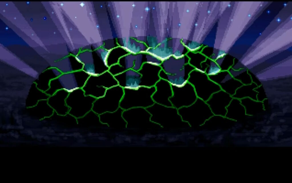
You see yourself winding a great war horn in the throne room of Castle British.

To save Britannia in Ultima Underworld II, the Avatar needs to exploit symmetries implicit in The Guardian’s spellcasting to travel to eight different parallel worlds, find a place from which His power stems, dispel it, encase themselves in a shell of basilisk oil-infused magic mud, immerse themselves in lava to bake it on, find a magic sigil, consume a djinn… it’s a whole thing. But ultimately it all leads to a climactic end scene in which the Avatar raises a horn retrieved from the Tomb of Praecor Loth and blows it to shatter a dome of blackrock.

Under a starry sky, a blackrock dome grows green cracks and shatters.
Blackrock’s really heavy, right? I’m not sure that shattering it above the building you’re inside is wise.

If you happen to find this clue on your first playthrough, it’s helpful exposition.

But that’s the end of this game, right? How can we possibly peer into the orb again?

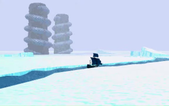
You see yourself sailing through majestic pillars cropping up out of the sea, on a voyage of discovery.

What’s being described there is the opening scene from the next game in the series, the as-yet-unreleased Ultima VII Part 2: Serpent Isle!

Ultima VII Part 2 introduction, showing a boat sailing through an icy sea corridor towards two serpent pillars.
Serpent Isle begins with the Avatar and their companions sailing out to some special pillars in pursuit of a bad guy.

This vision is a teaser of what’s to come. That’s just… magical, for both the character and the player.

The character uses fortune-telling magic to see their future, but the player is also seeing their future: if they’re playing Ultima Underworld II at or close to its release date, or they’re playing through the games in chronological order, they’re in a literal sense being shown what comes next in their life. That’s really cool.12

Let’s look again:

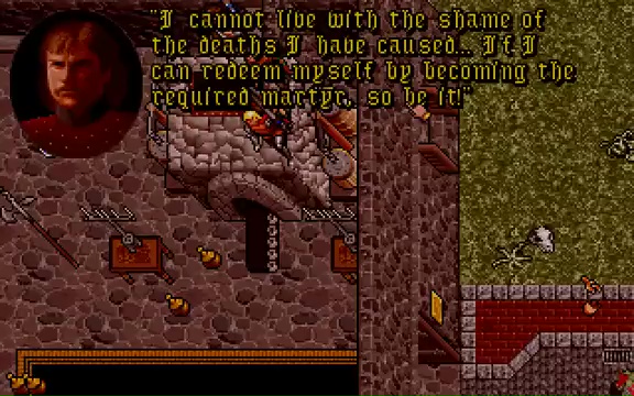
You see the obscure form of an old and dear friend, as he sacrifices his life for the good of all.

Some time after the party arrives on Serpent Isle, the Avatar’s companions are possessed by the Banes of Chaos and go on a murderous rampage. Later, there’s a ritual that will save the world, but at the cost of the death of one of the heroes. The Avatar is willing to make the ultimate sacrifice, but in the end Sir Dupre takes his place, unwilling to live within himself after seeing the carnage he has wrought.

Sir Dupre says "I cannot live with the shame of the deaths I have caused... If I can redeem myself by becoming the required martyr, so be it!"
The death of Sir Dupre, who first appeared way back in Ultima II, is somewhat undercut by his resurrection in Ultima IX. But perhaps you’ll let me pretend for a paragraph longer that Ultima IX doesn’t exist, okay?

At the end of Serpent Isle, the Avatar is plucked out of space and time and deposited into Pagan, The Guardian’s home base. The plot of Ultima VIII and Ultima IX revolve around the Avatar working to return to a radically-changed Britannia, attempting to fight The Guardian and bring to an end the Age of Armageddon, and ultimately merging and become one with Him before vanishing completely from the world.

An ankh symbol picked out in the constellations.
I don’t disagree with how Ultima IX got to where it was going, but I don’t like the route it took to get there. Or the hilariously-terrible bugs.

Which is why it’s perhaps quite fitting that if the Avatar in Underworld II looks into the orb one final time, they’re told…

You see nothing.

That’s it. That’s the end.

The end of the vision, certainly, but also: a vision of the end.

Depending on how you count the Ultima games13, this is the 13th of 17 in the series. We’re approaching the final chapter, and this Easter egg foreshadows that finale.

I feel hugely privileged that I got to experience it “organically”, by accident, as its authors presumably intended, back in 1993. But it also makes me happy to be able to share the story of it with you14.

If you haven’t seen it yet, you might enjoy watching the vlog version of this post, through which my enthusiasm for the topic might be more-palpable.

Footnotes

1 I’ve doubtless mentioned Ultima Underworld II before: for example both it and Ultima VII, as well as NetHack (mentioned elsewhere in this post) made it into my 2007 list of top 10 computer games that stole my life.

2 The release was delayed owing to testing revealing just too-many bugs, the penultimate of which was squashed on 18 December leaving just one more that the team couldn’t reproduce until the New Year

3 It suffered perhaps for the time of year it was released, but perhaps also for the fact that 1993 was a big year for video games and it was competing with The 7th Guest, Star Wars: Rebel Assault, Return to Zork , Myst, Disney’s Aladdin and, of course – later in the year – Doom.

4 Director/designer Paul Neurath apparently sang the praises of his team for improving texture mapping and viewport size constraints, and he’s right: they’re a huge improvement on Underworld I‘s. Neurath would later go on create the crowdfunded “spiritual successor” Underworld Ascendant, which was critically panned, which just goes to show that sometimes it’s better to get a tight team together and make it “until it’s done” than to put your half-baked idea on Kickstarter and hope you can work it out what you’re making before the money runs out.

5 Like Wolfenstein, the engine uses a mixture of software-rendered 3D (for walls and furniture) overlaid with traditionally-produced sprites (for characters and items).

6 All executed over a year before the release of the very first Elder Scrolls game. Just sayin’.

7 That king of emergent gameplay NetHack was showcasing emergent gameplay in a fantasy roleplaying game way back in the 1980s!

8 An interesting quirk of the game was that if you turned the graphics settings down to their lowest, secret doors would become just as visible as regular doors. If you’re sure there is one but you can’t quite find it, tweaking your graphics settings is much easier than casting a spell!

9 Do you like the “in the style of Underworld II” scrolls I’ve used in this post? I’ve made available the source code you need if you want to use them yourself.

10 Ultima IV is my personal favourite Ultima game, but I see the argument of people who claim that Ultima VII is the best of the series.

11 The Time Lord turns up throughout the game series. Way back in Ultima III, he appears in the Dungeon of Time where he provides a clue essential to defeating Exodus, and he appears or is referenced in most games from Ultima VII onwards. He doesn’t seem to appear in Ultima IV through Ultima VI, except… in Ultima IX, which wouldn’t be released until six years after Underworld II, it’s revealed that the Time Lord is the true identity of the seer Hawkwind… who provided the same kind of exposition and guidance in Ultima IV!

12 How did the Underworld II team know with such certainty what was being planned for Serpent Isle? At some point in 1992 project director Jeff George left Origin Studios and was replaced by lead designer Bill Armintrout, and the role of producer was assigned to… Warren Spector again! For some time, Spector was involved with both projects, providing an easy conduit for inter-team leaks.

13 How you count Ultima games and what specifically should be counted is a source of controversy in fan circles.

14 I’m sure many people reading this will have heard me talk about this particular Easter egg in-person before, over the last couple of decades. Some of you might even have heard me threaten to write a blog post about it, someday. Well: now I have. Tada! It only took me thirty years after experiencing it to write about it here, which is still faster than some things I’ve blogged about!

× × × × × × × × × × × × × × × ×

The Stupidest CSS

Yesterday, I wrote the stupidest bit of CSS of my entire career.

Screenshot of the WooCommerce Extensions Marketplace, with two sponsored products annotated to show (a) a pretty stripe at the top, (b) adding the word "Sponsored", and (c) a strange green blob alongside each.
Two new visual elements and one textual one will make it clear where a product’s placement in the marketplace is sponsored.

Owners of online shops powered by WooCommerce can optionally “connect” their stores back to Woo.com. This enables them to manage their subscriptions to any extensions they use to enhance their store1. They can also browse a marketplace of additional extensions they might like to consider, which is somewhat-tailored to them based on e.g. their geographical location2

In the future, we’ll be adding sponsored products to the marketplace listing, but we want to be transparent about it so yesterday I was working on some code that would determine from the appropriate API whether an extension was sponsored and then style it differently to make this clear. I took a look at the proposal from the designer attached to the project, which called for

  1. the word “Sponsored” to appear alongside the name of the extension’s developer,
  2. a stripe at the top in the brand colour of the extension, and
  3. a strange green blob alongside it

That third thing seemed like an odd choice, but I figured that probably I just didn’t have the design or marketing expertise to understand it, and I diligently wrote some appropriate code.3

I even attached to my PR a video demonstrating how my code reviewers could test it without spoofing actual sponsored extensions.

After some minor tweaks, my change was approved. The designer even swung by and gave it a thumbs-up. All I needed to do was wait for the automated end-to-end tests to complete, and I’d be able to add it to WooCommerce ready to be included in the next-but-one release. Nice.

In the meantime, I got started on my next bit of work. This one also included some design work by the same designer, and wouldn’t you know it… this one also had a little green blob on it?

A design for a completely different part of the WooCommerce Extensions Management tool, again with a little green blob. Dan's floating head looks thoughtful above it, with a thought-bubble reading "wow, we're really going all-in on these little blobs, aren't we?"
I’m almost embarrassed to admit that my first thought was that this must be part of some wider design strategy to put little green blobs everywhere.

Then it hit me. The blobs weren’t part of the design at all, but the designer’s way of saying “look at this bit, it’s important!”. Whoops!

So I got to rush over to my (already-approved, somehow!) changeset and rip out the offending CSS: the stupidest bit of CSS of my entire career. Not bad code per se, but reasonable code resulting from a damn-stupid misinterpretation of a designer’s wishes. Brilliant.

Footnotes

1 WooCommerce extensions serve loads of different purposes, like handling bookings and reservations and integrating with parcel tracking services.

2 There’s no point us suggesting an extension that helps you calculate Royal Mail shipping rates if you’re not shipping from the UK, for example!

3 A fun side-effect of working on open-source software is that my silly mistake gets immortalised somewhere where you can go and see it any time you like!

× ×

Zap

This week, I received a ~240V AC electric shock. I can’t recommend it.

A 10-year-old girl hangs from a scaffolding pole outside a white house.
As you may have guessed based on photos in previous posts, our house is currently wrapped in a convenient climbing frame scaffolding.

We’re currently having our attic converted, so we’ve had some electricians in doing the necessary electrical wiring. Shortly after they first arrived they discovered that our existing electrics were pretty catastrophic, and needed to make a few changes including a new fusebox and disconnecting the hilariously-unsafe distribution board in the garage.

Lifted floor showing central heating pipes and a tangle of electrical cables.
The owner before last of our house worked for SSEN and did all of his own wiring, and left us a rats’ nest of spaghetti wiring that our electricians described as being unlike anything they’d ever seen before. Also a literal rats’ nest under the decking, but we got rid of that already.

After connecting everything new up they began switching everything back on and testing the circuits… and we were surprised to hear arcing sounds and see all the lights flickering.

The electricians switched everything off and started switching breakers back on one at a time to try to identify the source of the fault, reasonably assuming that something was shorting somewhere, but no matter what combination of switches were enabled there always seemed to be some kind of problem.

Electricity shining a torch into a cupboard containing an fusebox with an open cover; the switches are in a mixture of on and off positions.
You know those escape room puzzles where you have to get the right permutation of switch combinations? This was a lot less fun than that.

Noticing that the oven’s clock wasn’t just blinking 00:00 (as it would after a power cut) but repeatedly resetting itself to 00:00, I pointed this out to the electricians as an indicator that the problem was occurring on their current permutation of switches, which was strange because it was completely different to the permutation that had originally exhibited flickering lights.

I reached over to point at the oven, and the tip of my finger touched the metal of its case…

Blam! I felt a jolt through my hand and up my arm and uncontrollably leapt backwards across the room, convulsing as I fell to the floor. I gestured to the cooker and shouted something about it being live, and the electricians switched off its circuit and came running with those clever EM-field sensor pens they use.

Somehow the case of the cooker was energised despite being isolated at the fusebox? How could that be?

Dan, bare-chested, lies in a hospital bed with an ECG hooked-up to him.
Buy one ECG appointment. Get a free partial chest-shaving free!

I missed the next bits of the diagnosis of our electrical system because I was busy getting my own diagnosis: it turns out that if you get a mains electric shock – even if you’re conscious and mobile – the NHS really want you to go to A&E.

At my suggestion, Ruth delivered me to the Minor Injuries unit at our nearest hospital (I figured that what I had wasn’t that serious, and the local hospital generally has shorter wait times!)… who took one look at me and told me that I ought to be at the emergency department of the bigger hospital over the way.

ECG printout showing a report of "Abnormal ECG: sinus arrhythmia".
The first hospital were kind enough to hook me up to an ECG before sending me on to the A&E department. It indicated possible cardiac arrhythmia in the sinus node – basically: my heart’s natural pacemaker was firing somewhat irregularly – which is kinda what you’d expect from an AC zap.

Off at the “right” hospital I got another round of ECG tests, some blood tests (which can apparently be used to diagnose muscular damage: who knew?), and all the regular observations of pulse and blood pressure and whatnot that you might expect.

And then, because let’s face it I was probably in better condition than most folks being dropped off at A&E, I was left to chill in a short stay ward while the doctors waited for test results to come through.

Two electricians, one in a hard hat, look in an outdoor metering cupboard by torchlight.
Apparently our electricity meter blew itself up somewhere along the way, leaving us with even less of a chance to turn the power back on again.

Meanwhile, back at home our electricians had called-in SSEN, who look after the grid in our area. It turns out that the problem wasn’t directly related to our electrical work at all but had occurred one or two pylons “upstream” from our house. A fault on the network had, from the sounds of things, resulted in “live” being sent down not only the live wire but up the earth wire too.

That’s why appliances in the house were energised even with their circuit breakers switched-off: they were connected to an earth that was doing pretty-much the opposite of what an earth should: discharging into the house!

Linesmen examining an electricity pylon by torchlight.
For the next day or so, a parade of linesmen climbed up and down all the pylons in the field behind our house, hunting for the source of the problem.

It seems an inconceivable coincidence to me that a network fault might happen to occur during the downtime during which we happened to have electricians working, so I find myself wondering if perhaps the network fault had occurred some time ago but only become apparent/dangerous as a result of changes to our household configuration.

I’m no expert, but I sketched a diagram showing how such a thing might happen (click to embiggen). I’ll stress that I don’t know for certain what went wrong: I’m just basing this on what I’ve been told my SSEN plus a little speculation:

MS Paint grade illustration showing how a faulty transformer on a power pole, crossing live with earth, might go unnoticed as a result of the earth spike behind our garage until the garage's (unsafe) circuit is disconnected.

By the time I was home from the hospital the following day, our driveway was overflowing with the vehicles of grid engineers to the point of partially blocking the main street outside (which at least helped ensure that people obeyed our new 20mph limit for a change).

A driveway full of vehicles spills out onto the nearby road.
We weren’t even able to get our own car onto our driveway when we got back from the hospital.

Two and a half days later, I’m back at work and mostly recovered. I’ve still got some discomfort in my left hand, especially if I try to grip anything tightly, but I’m definitely moving in the right direction.

It’s actually more-annoying how much my chest itches from having various patches of hair shaved-off to make it possible to hook up ECG electrodes!

A linesman hangs from his climbing belt at the top of a pole, while two others look on from the ground.
The actual conversation at this point seemed to consist of the guy at the top of the pole confirming that yes, he really had disconnected the live wire from our house, and one at the bottom saying he can’t have because he’s still seeing electricity flowing. Makes sense now, doesn’t it?

Anyway, the short of it is that I recommend against getting zapped by the grid. If it had given me superpowers it might have been a different story, but I guess it just gave me sore muscles and a house with a dozen non-working sockets.

× × × × × × × × × ×

Yours Quim-cerely

A lovely letter from the Vagina Museum – which I’ve not had the opportunity to visit yet – came through my letterbox:

Printed letter on Vagina Museum headed paper, reading: Dear Dan Q, I'm assuming you donated £50 on 1st February in response to my desperate plea for help on Mastodon. I'm pleased to say this was printed on our brand spanking new Brother Laser. The entire Vagina Museum thanks you for your generosity in our hour of need. Yours quim-cerely, Zoe Williams; Head of Communications and Fundraising
“Yours quim-cerely,” doesn’t appear in any style guide but is now the best sign-off in any letter I’ve ever received.

This moment of joy was kick-started when I casually dropped in on a conversation about printer recommendations. I’ve got a big ol’ Brother printer here, and it’s great, not least because even though it’s got a tonne of features like duplexing and (double-sided) scanning and photocopying and it’s even got a fax machine built in for some reason… it doesn’t try to be any more “smart” than it needs to be. It doesn’t talk to Alexa or order itself more toner (it even gets-by with knockoff toner!) or try to do anything well… except print things, which it does wonderfully.

For this and other reasons I recommended they buy a Brother.

Then, alongside some other Fediversians, I chipped in to help them buy one.

Totally worth it for the letter alone. Now I just need to find an excuse to visit an exhibition!

×

BBC News… without the crap

Did I mention recently that I love RSS? That it brings me great joy? That I start and finish almost every day in my feed reader? Probably.

I used to have a single minor niggle with the BBC News RSS feed: that it included sports news, which I didn’t care about. So I wrote a script that downloaded it, stripped sports news, and re-exported the feed for me to subscribe to. Magic.

RSS reader showing duplicate copies of the news story "Barbie 2? 'We'd love to,' says Warner Bros boss", and an entry from BBC Sounds.
Lately my BBC News feed has caused me some annoyance and frustration.

But lately – presumably as a result of technical changes at the Beeb’s side – this feed has found two fresh ways to annoy me:

  1. The feed now re-publishes a story if it gets re-promoted to the front pagebut with a different <guid> (it appears to get a #0 after it when first published, a #1 the second time, and so on). In a typical day the feed reader might scoop up new stories about once an hour, any by the time I get to reading them the same exact story might appear in my reader multiple times. Ugh.
  2. They’ve started adding iPlayer and BBC Sounds content to the BBC News feed. I don’t follow BBC News in my feed reader because I want to watch or listen to things. If you do, that’s fine, but I don’t, and I’d rather filter this content out.

Luckily, I already have a recipe for improving this feed, thanks to my prior work. Let’s look at my newly-revised script (also available on GitHub):

#!/usr/bin/env ruby
require 'bundler/inline'

# # Sample crontab:
# # At 41 minutes past each hour, run the script and log the results
# */20 * * * * ~/bbc-news-rss-filter-sport-out.rb > ~/bbc-news-rss-filter-sport-out.log 2>>&1

# Dependencies:
# * open-uri - load remote URL content easily
# * nokogiri - parse/filter XML
gemfile do
  source 'https://rubygems.org'
  gem 'nokogiri'
end
require 'open-uri'

# Regular expression describing the GUIDs to reject from the resulting RSS feed
# We want to drop everything from the "sport" section of the website, also any iPlayer/Sounds links
REJECT_GUIDS_MATCHING = /^https:\/\/www\.bbc\.co\.uk\/(sport|iplayer|sounds)\//

# Load and filter the original RSS
rss = Nokogiri::XML(open('https://feeds.bbci.co.uk/news/rss.xml?edition=uk'))
rss.css('item').select{|item| item.css('guid').text =~ REJECT_GUIDS_MATCHING }.each(&:unlink)

# Strip the anchors off the <guid>s: BBC News "republishes" stories by using guids with #0, #1, #2 etc, which results in duplicates in feed readers
rss.css('guid').each{|g|g.content=g.content.gsub(/#.*$/,'')}

File.open( '/www/bbc-news-no-sport.xml', 'w' ){ |f| f.puts(rss.to_s) }
It’s amazing what you can do with Nokogiri and a half dozen lines of Ruby.

That revised script removes from the feed anything whose <guid> suggests it’s sports news or from BBC Sounds or iPlayer, and also strips any “anchor” part of the <guid> before re-exporting the feed. Much better. (Strictly speaking, this can result in a technically-invalid feed by introducing duplicates, but your feed reader oughta be smart enough to compensate for and ignore that: mine certainly is!)

You’re free to take and adapt the script to your own needs, or – if you don’t mind being tied to my opinions about what should be in BBC News’ RSS feed – just subscribe to my copy at: https://fox.q-t-a.uk/bbc-news-no-sport.xml

×

RSS > ActivityPub

RSS is better than ActivityPub1.

Photograph of a boxing match, but with the heads of the competitors replaced with the ActivityPub and RSS logos (and "AP" or "RSS" written on their clothes, respectively). RSS is delivering a powerful uppercut to ActivityPub.
A devastating blow by RSS against a competitor 19 years his junior! For updates on this bout as it develops, don’t forget to subscribe… using either protocol.

When I subscribe to content, I want:

  • Resilient failsafes. ActivityPub has many points-of-failure. A notification might fail to complete transmission as a result of downtime, faults, or network conditions, and the receiving server might never know. A feed reader, conversely, can tell you that an address 404’d or the server was down.
  • Retroactive access. Once you fix the problem above… you still don’t get the message you missed: it’s probably gone forever – there’s no retroactive access. The same is true when your ActivityPub server connects with a peer for the first time: you only ever get new content after that point. RSS, on the other hand, provides some number of “recent” items the moment you first subscribe.
  • Simple subscriptions. RSS can be served from a statically-hosted single file, which makes it suitable to deploy anywhere as well as consume using anything. It can be read, after a fashion, in anything from Lynx upwards.

RSS ticks all these boxes. If I can choose between RSS and ActivityPub to subscribe to your content, and I don’t need a real-time update, I’m probably going to choose RSS.

About a month later, Matthias Pfefferle wrote a great post that makes a good “next stop” if you’re on a deep dive…

Footnotes

1 I feel like this statement needs a few clarifications and caveats, but my hot take looks spicier if I bury them in a footnote!

  • By RSS, I mean whichever pull-based basic HTTP you like, be that Atom, JSON Feed, h-entry, or even just properly-marked-up HTML5: did you know that the <article> element is intended to be suitable for syndication use?
  • Obviously I appreciate that RSS and ActivityPub are different tools for different jobs, and there are doubtless use-cases for which ActivityPub is clearly the superior solution.
  • I certainly don’t object to services providing both RSS and ActivityPub as syndication options, like Mastodon does, where both might be good choices.
×

Out as Poly at Work

During one of the periods today that Facebook wasn’t down, a friend who makes use of the platform shared a Facebook post with me, which read:

Has anyone informed work/colleagues about being ENM and how was it received?

I’ve informed a few colleagues but I am considering informing my team as part of my Team Champion and EDI role.

I’ve been “out” at every one of the employers1 since I entered into my first open/nonmonogamous relationship a couple of decades ago.

I didn’t do so immediately: in fact, I waited almost until the point that coming out was an academic necessity! The point at which it was only a matter of time before somebody thought they’d caught us “cheating”… or else because I didn’t want to have to lie to coworkers about e.g. from whom a romantic gift might have come.

Laptop and mug alongside a notebook and pencil. In the notebook is written "TODO: 1. Come out to colleagues. 2. ???. 3. Profit."
I guess I’ll squeeze in “come out to colleagues” in between the project planning meeting and working on rolling out the server upgrades.

Here’s how it went to be “out” at each of the three full-time jobs I’ve held over that period:

SmartData

We lived and worked in and around a small town, and in our small tight-knit team we all had a reasonable handle on what was going on in one another’s personal lives. By the time I was actively in a relationship with Ruth (while still in a relationship with Claire, whom all my coworkers had met at e.g. office parties and the like), it just seemed prudent to mention it, as well as being honest and transparent.

Dan with coworkers and friends drinking in a pub.
This photograph – featuring some of my coworkers – was taken in 2005. At that point, they probably all thought of me as a regular, normal person. At least, as far as my relationship structure was concerned. Not in any other way. Obviously.

It went fine. And it made Monday watercooler conversations about “who what I did at the weekend” simpler. Being a small team sharing a single open-plan office meant that I was able to mention my relationship status to literally the entire company at once, and everybody took it with a shrug of noncommittal acceptance.

The Bodleian Libraries

The Bodleian Libraries was a much bigger beast, and in turn a part of the massive University of Oxford. It was big enough to have a “LGBT+ Staff” network within its Equality and Diversity unit, within which – because of cultural intersections2 – I was able to meet a handful of other poly folk at the University.

Dan poses with Bodleian coworkers in front of a party feast in a low-ceilinged office.
This motley crew were exactly as warm and accepting a bunch as you could ask for.

I mentioned very early on – as soon as it came up organically – the structure of the relationship I was in, and everybody was cool (or failing that, at least professional) about it. Curious coworkers asked carefully-crafted questions, and before long (and following my lead) my curious lifestyle choices were as valid a topic for light-hearted jokes as anything else in that fun and gossipy office.

And again: it paid-off pragmatically, especially when I took parental leave after the birth of each of our two kids3.

It also helped defuse a situation when I was spotted by a more-distant coworker on my way back from a lunchtime date with a lover who wasn’t Ruth, and my confused colleague introduced herself to the woman that she assumed must’ve been the partner she’d heard about. When I explained that no, this is a different person I’m seeing my colleague seemed taken aback, and I was glad to be able to call on a passing coworker who knew me better to back me up in my assertion that no, this wasn’t just me trying to lie to cover some illicit work affair! Work allies are useful.

Automattic

I’ve been with Automattic for four and a half years now, and this time around I went one step further in telling potential teammates about my relationship structure by mentioning it in my “Howdymattic” video – a video introduction new starters are encouraged to record to say hi to the rest of the company4.

Framegrab from Dan's Howdymattic video showing him making a "V" shape with his fingers alongside a diagram of his V-shaped relationship.
Some full-on MSPaint grade titling made it into that video, didn’t it?

A convenient side-effect of this early coming-out was that I found myself immediately inducted into the “polymatticians” group – a minor diversity group within Automattic, comprising a massive 1.2% of the company, who openly identify as engaging in nonmonogamous relationships5!

That was eye-opening. Not only does Automattic have a stack of the regular inclusivity groups you might expect from a big tech company (queer, Black, women, trans, neurodiverse) and a handful of the less-common ones (over-40s, cancer survivors, nondrinkers, veterans), they’ve also got a private group for those of us who happen to be both Automatticians and in (or inclined towards) polyamorous relationships. Mind blown.

My relationship structure’s been… quietly and professionally accepted. It doesn’t really come up (why would it? in a distributed company it has even less-impact on anything than it did in my previous non-distributed roles)… outside of the “polymatticians” private space.

In summary: I can recommend being “out” at work. So long as you’d feel professionally safe to do so: relationship structure isn’t necessarily a protected characteristic (it’s complicated), and even if it were you might be careful about mentioning it in some environments. It’s great to have the transparency to not have to watch your words when a coworker asks about “your partner”. Plus being free to be emotionally honest at work is just good for your mental wellbeing, in my opinion! If you trust your coworkers, be honest with them. If you don’t… perhaps you need to start looking for a better job?

Footnotes

1 I’m not counting my freelance work during any of those periods, although I’ve been pretty transparent with them too.

2 Let’s be clear: most queer folks, just like most straight folks, seem to be similarly-inclined towards monogamy. But ethnical non-monogamy in various forms seems to represent a larger minority within queer communities than outside them. There’s all kinds of possible reasons for this, and smarter people than me have written about them, but personally I’m of the opinion that, for many, it stems from the fact that by the time you’re societally-forced to critically examine your relationships, you might as well go the extra mile and decide whether your relationship structure is right for you too. In other words: I suspect that cis hetro folks would probably have a proportional parity of polyamory if they weren’t saturated with media and cultural role models that show them what their relationship “should” look like.

3 Unwilling to lie, I made absolutely clear that I was neither the father of either of them nor the husband of their mother (among other reasons, the law prohibits Ruth from marrying me on account of being married to JTA), but pointed out that my contract merely stipulated that I was the partner of a birth parent, which was something I’d made completely clear since I first started working there. I’m not sure if I was just rubber-stamped through the University’s leave process as a matter of course or if they took a deeper look at me and figured “yeah, we’re not going to risk picking a legal fight with that guy”, but I got my leave granted.

4 If you enjoyed my “Howdymattic”, you’ll probably also love the outtakes.

5 There are dozens of us! Dozens!

× × × ×

Sonarr > Huginn > Slack

I use a tool called Sonarr to, uhh1, keep track of when new episodes of television shows are released, regardless of what platform they’re on (Netflix, Prime, iPlayer, whatever) and notify me so I remember to watch it.

For several years, I’ve used IFTTT as the intermediary, receiving webhooks from Sonarr and translating them for Slack:

A series of webhooks sent from Sonarr to IFTTT to Slack.
This worked for years, but it’s time to retire it.

IFTTT‘s move to kill its Legacy Pro plan2 – which I was on – gave me reason to re-assess this configuration. It turns that the only Pro feature I was using was an IFTTT “filter” to convert the Sonarr webhooks to a Slack-friendly-format.

Given that I’m running an installation of Huginn on my home network anyway, I resolved to re-implement this flow in Huginn and cancel my IFTTT subscription.

A series of webhooks sent from Sonarr to Huginn to Slack.
Raven-powered automation is the new hotness.

This turned out to be so easy I wonder why I never did it before.

First, I created a Webhook Agent and gave the URL to Sonarr.

Then I connected that to a Slack Agent with the following configuration:

{
  "webhook_url": "https://hooks.slack.com/services/...",
  "channel": "#sonarr",
  "username": "Sonarr",
  "message": "*<https://thetvdb.com/?tab=series&id={{series.tvdbId}}|{{series.title}}>*\nNew episodes:{% for episode in episodes %}\n• S{{episode.seasonNumber}}E{{episode.episodeNumber}} {{episode.title}}{% endfor %}",
  "icon": ":tv:"
}
I’ve omitted my Slack webhook URL so you don’t spam me. I tried for far too long to get the pluralize filter to work so it’d say “episode” or “episodes” as appropriate before realising I didn’t care enough and gave up.

Then all I needed to do was re-emit some of the previous webhooks to test it:

Slack chat window showing notifications: (1) a new episode of Resident Alien, announced by IFTTT, (b) the same episode, announced by "Sonarr", (c) two episodes of Marvel's Spidey and His Amazing Friends, also announced by "Sonarr".
As a bonus, I swapped out the IFTTT logo for Slackmoji’s :tv: icon and added the “Sonarr” username, as shown in my code sample.

Now I’ll continue to know when there’s new television to watch3!

I love the power and flexibility that Huginn provides to help automate your life. It does many of the things that I used to do with a handful of cron jobs and shell scripts, but all in one convenient place.

Footnotes

1 I’ve heard there are other uses for the tool. Your mileage may vary. Don’t forget to pay for your content, if possible.

2 Like many others, I originally signed up to the plan under the promise that the price would be honoured forever. Turns out “forever” means “three years”: who knew?

3 It’s especially useful when you’re between seasons or a show is on hiatus to be reminded that it’s back and I should go and watch it. Hey, there’s a thought: I wonder if I can extract the subtitles from shows and run them through a summarising LLM to give me a couple of paragraphs reminding me “what happened last series” if the show’s been on a long break?

× × ×

Freedom of the Mountain

During a family holiday last week to the Three Valleys region of the French Alps for some skiing1, I came to see that I enjoy a privilege I call the freedom of the mountain.

In black skiwear, Dan looks into the camera from a bench in the snow, his skis upright behind him.
“Mornin’. Let’s go skiing.”

The Freedom

The freedom of the mountain is a privilege that comes from having the level of experience necessary to take on virtually any run a resort has to offer. It provides a handful of benefits denied to less-confident skiers:

  • I usually don’t feed to look at a map to plan my next route; whichever way I go will be fine!
  • When I reach one or more lifts, I can choose which to take based on the length of their queue, rather than considering their destinations.
  • When faced with a choice of pistes (or an off-piste route), my choice can be based on my mood, how crowded they are, etc., rather than their rated difficulty.
A snow-covered Alpine glacier sandwiched into a gully of exposed rocks.
Let’s tear this up, yo.

The downside is that I’m less well-equipped to consider the needs of others! Out skiing with Ruth one morning I suggested a route back into town that “felt easy” based on my previous runs, only to have her tell me that – according to the map – it probably wasn’t!

Approaching the Peak

The kids spent the week in lessons. It’s paying off: they’re both improving fast, and the eldest has got all the essentials down and it’s working on improving her parallel turns and on “reading the mountain”. It’s absolutely possible that the eldest, and perhaps both of them, will be a better skier than me someday2.

I’m not perfect, mind. While skiing backwards and filming, I misjudged the height of an arch and hit the back of the head with it… despite the child shouting to warn me! 😅

Maybe, as part of my effort to do what I’m bad at, I should have another go at learning to snowboard. I always found snowboarding frustrating because everything I needed to re-learn was something that I could already do much better and easier on skis. But perhaps if I can reframe that frustration through the lens of learning itself as the destination, I might be in a better place. One to consider for next time I hit the piste.

Footnotes

1 Also a little geocaching and some mountainside Where’s Wally?

2 Assuming snow is still a thing in ten years time.

× ×

Shiftless Progressive Enhancement

Progressive enhancement is a great philosophy for Web application development. Deliver all the essential basic functionality using the simplest standards available; use advanced technologies to add bonus value and convenience features for users whose platform supports them. Win.

Screenshot showing starcharts in Three Rings. With JS disabled, all shifts within the last 3 years are shown, with a link to show historic shifts. With JS enabled, only shifts from the current calendar year are shown, with filters available to dynamically change which year(s) are covered.
JavaScript disabled/enabled is one of the most-fundamental ways to differentiate a basic from an enhanced experience, but it’s absolutely not the only way (especially now that feature detection in JavaScript and in CSS has become so powerful!).

In Three Rings, for example, volunteers can see a “starchart” of the volunteering shifts they’ve done recently, at-a-glance, on their profile page1. In the most basic case, this is usable in its HTML-only form: even with no JavaScript, no CSS, no images even, it still functions. But if JavaScript is enabled, the volunteer can dynamically “filter” the year(s) of volunteering they’re viewing. Basic progressive enhancement.

If a feature requires JavaScript, my usual approach is to use JavaScript to add the relevant user interface to the page in the first place. Those starchart filters in Three Rings don’t appear at all if JavaScript is disabled. A downside to this approach is that the JavaScript necessarily modifies the DOM on page load, which introduces a delay to the page being interactive as well as potentially resulting in layout shift.

That’s not always the best approach. I was reminded of this today by the website of 7-year-old Shiro (produced with, one assumes, at least a little help from Saneef H. Ansari). Take a look at this progressively-enhanced theme switcher:

No layout shift, no DOM manipulation. And yet it’s still pretty clear what features are available.

The HTML that’s delivered over-the-wire provides a disabled <select> element, which gains the CSS directive cursor: not-allowed;, to make it clear to the used that this dropdown doesn’t do anything. The whole thing’s wrapped in a custom element.

When that custom element is defined by the JavaScript, it enhances the dropdown with an event listener that implements the theme changes, then enables the disabled <select>.

<color-schemer>
  <form>
    <label>
      Theme
      <select disabled>
        <option value="">System</option>
        <option value="dark">Dark</option>
        <option value="light" selected>Light</option>
      </select>
    </label>
  </form>
</color-schemer>
I’m not convinced by the necessity of the <form> if there’s no HTML-only fallback… and the <label> probably should use a for="..." rather than wrapping the <select>, but otherwise this code is absolutely gorgeous.

It’s probably no inconvenience to the minority of JS-less users to see a theme switcher than, when they go to use it, turns out to be disabled. But it saves time for virtually everybody not to have to wait for JavaScript to manipulate the DOM, or else to risk shifting the layout by revealing a previously-hidden element.

Altogether, this is a really clever approach, and I was pleased today to be reminded – by a 7-year-old! – of the elegance of this approach. Nice one Shiro (and Saneef!).

Footnotes

1 Assuming that administrators at the organisation where they volunteer enable this feature for them, of course: Three Rings‘ permission model is robust and highly-customisable. Okay, that’s enough sales pitch.

×

100 Days To Offload

The ever-excellent Kev Quirk in 2020 came up with this challenge: write a blog post on each of 100 consecutive days. He called it #100DaysToOffload, in nominal reference to the “100 days of code” challenge. I was reflecting upon this as I reach this, my 36th consecutive day of blogging and my longest ever “daily streak” (itself a spin-off of my attempt at Bloganuary this year), and my 48th post of the year so far.

Monochrome photograph showing sprinters at the starting line.
I guess I’ve always been more of a sprinter/hurdles blogger than a marathon runner.

Might I meet that challenge? Maybe. But it turns out it’s easier than I thought because Kev revised the rules to require only 100 posts in a calendar year (or any other 365-day period, but I’m not going to start thinking about the maths of that).

That’s not only much more-achievable… I’ve probably already achieved it! Let’s knock out some SQL to check how many posts I made each year:

SELECT
  YEAR(wp_posts.post_date_gmt) yyyy,
  COUNT(wp_posts.ID) total
FROM
  wp_posts
WHERE
  wp_posts.post_status='publish'
  AND wp_posts.post_type='post'
GROUP BY yyyy
ORDER BY yyyy
My code’s actually a little more-complicated than this, because of some plot, but this covers the essentials.

A big question in some years is what counts as a post. Kev’s definition is quite liberal and includes basically-everything, but I wonder if mine shouldn’t perhaps be stricter. For example:

  • Should I count checkins, even though they’re not always born as blog posts but often start as logs on geocaching websites? (My gut says yes!)
  • Do reposts and bookmarks contribute, a significant minority of which are presented without any further interpretation by me? (My gut says no!)
  • Does a vlog version of a blog post count separately, or is it a continuation of the same content? (My gut says the volume is too low to matter!)
  • Can a retroactive achievement (i.e. from before the challenge was announced) count? Kev writes “there is no specific start date”, but it seems a little counter to the idea of it specifically being a challenge to claim it when you weren’t attempting the challenge at the time.
  • And so on…
Year Posts Success? Notes
1998 7 ❌ No Some posts are lost from 1998/1999. If they were recovered I might have made 100 posts in 1999, but probably not in 1998 as I only started blogging on 27 September 1998.
1999 66 ❌ No
2000 2 ❌ No
2001 11 ❌ No
2002 5 ❌ No
2003 189 🏆 Yes Achieved 1 September, with a post about an article on The Register about timewasting. Or, if we allow reposts, three days earlier with a repost about Claire's car being claimed by the sea.
2004 374 🏆 Yes An early win on 20 April, with a made-up Chez Geek card. Or if we allow reposts, two days earlier with thoughts on a confusing pro-life (???) website.
2005 381 🏆 Yes In a highly-productive year of blogging, achieved on 7 April with a post about enjoy curry and public information films with friends. If we allow bookmarks (I was highly-active on del.icio.us at the time!), achieved even earlier on 18 February with some links to curious websites.
2006 206 🏆 Yes On 21 July, I shared a personality test (which was actually my effort to repeat an experiment in using Barnum-Forer statements) - I didn't initially give away that I was the author of the "test". Non-pedants will agree I achieved the goal earlier, on 19 June, with my thoughts on a programming language for a hypothetical infinitely-fast computer.
2007 166 🏆 Yes Achieved on 2 July with thoughts on films I'd watched and board games I'd played recently. Or arguably 12 days earlier with Claire's birthday trip to Manchester.
2008 86 ❌ No
2009 79 ❌ No
2010 159
(84 for pedants)
✅ Yes* A heartfelt post about saying goodbye to Aberystwyth as I moved to Oxford on 16 June was my 100th of the year. Pedants might argue that this year shouldn't count, but so long as you're willing to count checkins (and you should) then it would... and my qualifying post would have come only a couple of days later, with a post about the Headington Shark, which I had just moved-in near to.
2011 177 🏆 Yes Reached the goal on 28 October when I wrote about mild successes in my enquiries with the Office of National Statistics about ensuring that information about polyamorous households was accurately recorded. Or if we earlier on 9 June with a visual gag about REM lyrics if you accept all my geocache logs as posts too (and again: you should).
2012 129
(87 for pedants)
✅ Yes* My 100th post of the year came on 28 August when I wrote about launching a bus named after my recently-deceased father. You have to be willing to accept both checkins and reposts as posts to allow this year to count.
2013 138
(59 for pedants)
😓 Probably not I'm not convined this low-blogging year should count: a clear majority of the posts were geocaching logs, and they weren't always even that verbose (consider this candidate for 100th post of 2013, from 1 October).
2014 335
(22 for pedants)
🙁 Not really Another geocache log heavy, conventional blogpost light year that I'm not convinced should count, evem if the obvious candidate for 100th post would be 18 May's cool article about geocaching like Batman!
2015 205
(18 for pedants)
🙁 Not really Still no, for the same reasons as above.
2016 163
(37 for pedants)
🙁 Not really
2017 301
(42 for pedants)
🙁 Not really
2018 547
(87 for pedants)
✅ Yes* I maintain that checkins should count, even when they're PESOS'd from geocaching sites, so long as they don't make up a majority of the qualifying posts in a year. In which case this year should qualify, with the 100th post being my visit to this well-hidden London pub while on my way to a conference.
2019 387
(86 for pedants)
✅ Yes* Similarly this year, when on 15 August I visited a GNSS calibration point in the San Francisco Bay Area... on the way to another conference!
2020 221
(64 for pedants)
✅ Yes* Barely made it this year (ignoring reposts, of which I did lots), with my 21 December article about a little-known (and under-supported) way to inject CSS using HTTP headers, which I later used to make a web page for which View Souce showed nothing.
2021 190
(57 for pedants)
✅ Yes* A cycle to a nearby geocache was the checkin that made the 100th post of this year, on 27 August.
2022 168
(55 for pedants)
✅ Yes* My efforts to check up on one of my own geocaches on 7 September scored the qualifying spot.
2023 164
(86 for pedants)
✅ Yes* My blogging ramped up again this year, and on 24 August I shared a motivational poster with a funny twist, plus a pun at the intersection between my sexuality and my preferred mode of transport.
2024 138
(85 for pedants)
✅ Yes*
Total 4,999 Total count of all the posts.
Doesn't add up? Not all posts feature in one of the years above!

* Pedants might claim this year was not a success for the reasons described above. Make your own mind up.

In any case, I’d argue that I clearly achieved the revised version of the challenge on certainly six, probably fourteen, arguably (depending on how you count posts) as many as nineteen different years since I started blogging in 1998. My least-controversial claims would be:

  1. September 2003, with Timewasting
  2. April 2004, with Chez Geek Card of the Day
  3. April 2005, with Curry with Alec and Suz
  4. July 2006, with Coolest Personality Test I’ve Ever Seen
  5. July 2007, with It’s All Fun and Games
  6. June 2010, with Saying Goodbye
  7. October 2011, with Poly and the Census – Success! (almost)
  8. August 2012, with A Bus Called Peter
  9. June 2018, with Dan Q found GLW6CMKQ 16th Century Pub (Central London) 
  10. August 2019, with Dan Q found GC6KR0H Bay Area Calibration Point #4 – New Technology
  11. December 2020, with The Fourth Way to Inject CSS
  12. August 2021, with Dan Q found GC531M9 Walk by the Firehouse #1
  13. October 2022, with Dan Q performed maintenance for GC9Z37H Friar’s Farm – Woodland Walk
  14. August 2023, with Inclusivity

Given all these unanswered questions, I’m not going to just go ahead and raise a PR against the Hall of Fame! Instead, I’ll leave it to Kev to decide whether I’m (a) eligible to claim a 14-time award, (b) merely eligible for a 4-time award for the years following the challenge starting, or (c) ineligible to claim success until I intentionally post 100 times in a year (in, at current rates, another two months…). Over to you, Kev…

Update: Kev’s agreed that I can claim the most-recent four of them, so I raised a PR.

×

Oldest Digital Photo… of Me

Some younger/hipper friends tell me that there was a thing going around on Instagram this week where people post photos of themselves aged 21.

I might not have any photos of myself aged 21! I certainly can’t find any digital ones…

Dan, aged 22, stands in a cluttered flat with his partner Claire and several members of Dan's family.
The closest I can manage is this photo from 23 April 2003, when I was 22 years old.

It must sound weird to young folks nowadays, but prior to digital photography going mainstream in the 2000s (thanks in big part to the explosion of popularity of mobile phones), taking a photo took effort:

  • Most folks didn’t carry their cameras everywhere with them, ready-to-go, so photography was much more-intentional.
  • The capacity of a film only allowed you to take around 24 photos before you’d need to buy a new one and swap it out (which took much longer than swapping a memory card).
  • You couldn’t even look at the photos you’d taken until they were developed, which you couldn’t do until you finished the roll of film and which took at least hours – more-realistically days – and incurred an additional cost.

I didn’t routinely take digital photos until after Claire and I got together in 2002 (she had a digital camera, with which the photo above was taken). My first cameraphone – I was a relatively early-adopter – was a Nokia 7650, bought late that same year.

It occurs to me that I take more photos in a typical week nowadays, than I took in a typical year circa 2000.

Monochrome photo of a toddler, smiling broadly, pointing at the camera.
The oldest analogue photo of me that I own was taken on 2 October 1982, when I was 22 months old.

This got me thinking: what’s the oldest digital photo that exists, of me. So I went digging.

I might not have owned a digital camera in the 1990s, but my dad’s company owned one with which to collect pictures when working on-site. It was a Sony MVC-FD7, a camera most-famous for its quirky use of 3½” floppy disks as media (this was cheap and effective, but meant the camera was about the size and weight of a brick and took about 10 seconds to write each photo from RAM to the disk, during which it couldn’t do anything else).

In Spring 1998, almost 26 years ago, I borrowed it and took, among others, this photo:

Dan aged 17 - a young white man with platinum blonde shoulder-length hair - stands in front of a pink wall, holding up a large, boxy digital camera.
I’m aged 17 in what’s probably the oldest surviving digital photo of me, looking like a refugee from Legoland in 640×480 glorious pixels.

I’m confident a picture of me was taken by a Connectix QuickCam (an early webcam) in around 1996, but I can’t imagine it still exists.

So unless you’re about to comment to tell me know you differently and have an older picture of me: that snap of me taking my own photo with a bathroom mirror is the oldest digital photo of me that exists.

× × ×

Netscape’s Untold Webstories

I mentioned yesterday that during Bloganuary I’d put non-Bloganuary-prompt post ideas onto the backburner, and considered extending my daily streak by posting them in February. Here’s part of my attempt to do that:

Let’s take a trip into the Web of yesteryear, with thanks to our friends at the Internet Archive’s WayBack Machine.

The page we’re interested in used to live at http://www.netscape.com/comprod/columns/webstories/index.html, and promised to be a showcase for best practice in Web development. Back in October 1996, it looked like this:

Screenshot from Netscape Columns: Web Site Stories: a Coming Soon page which says "The series is scheduled to debut in November."

The page is a placeholder for Netscape Webstories (or Web Site Stories, in some places). It’s part of a digital magazine called Netscape Columns which published pieces written by Marc Andreeson, Jim Barksdale, and other bigwigs in the hugely-influential pre-AOL-acquisition Netscape Communications.

This new series would showcase best practice in designing and building Web sites1, giving a voice to the technical folks best-placed to speak on that topic. That sounds cool!

Those white boxes above and below the paragraph of text aren’t missing images, by the way: they’re horizontal rules, using the little-known size attribute to specify a thickness of <hr size=4>!2

Certainly you’re excited by this new column and you’ll come back in November 1996, right?

Screenshot from Netscape Columns: Web Site Stories: a Coming Soon page which says "The series is scheduled to begin in January."

Oh. The launch has been delayed, I guess. Now it’s coming in January.

The <hr>s look better now their size has been reduced, though, so clearly somebody’s paying attention to the page. But let’s take a moment and look at that page title. If you grew up writing web pages in the modern web, you might anticipate that it’s coded something like this:

<h2 style="font-variant: small-caps; text-align: center;">Coming Soon</h2>

There’s plenty of other ways to get that same effect. Perhaps you prefer font-feature-settings: 'smcp' in your chosen font; that’s perfectly valid. Maybe you’d use margin: 0 auto or something to centre it: I won’t judge.

But no, that’s not how this works. The actual code for that page title is:

<center>
  <h2>
    <font size="+3">C</font>OMING
    <font size="+3">S</font>OON
  </h2>
</center>

Back when this page was authored, we didn’t have CSS3. The only styling elements were woven right in amongst the semantic elements of a page4. It was simple to understand and easy to learn… but it was a total mess5.

Anyway, let’s come back in January 1997 and see what this feature looks like when it’s up-and-running.

Screenshot from Netscape Columns: Web Site Stories: a Coming Soon page which says "The series is scheduled to begin in the spring."

Nope, now it’s pushed back to “the spring”.

Under Construction pages were all the rage back in the nineties. Everybody had one (or several), usually adorned with one or more of about a thousand different animated GIFs for that purpose.6

Rotating animated "under construction" banner.

Building “in public” was an act of commitment, a statement of intent, and an act of acceptance of the incompleteness of a digital garden. They’re sort-of coming back into fashion in the interpersonal Web, with the “garden and stream” metaphor7 taking root. This isn’t anything new, of course – Mark Bernstein touched on the concepts in 1998 – but it’s not something that I can ever see returning to the “serious” modern corporate Web: but if you’ve seen a genuine, non-ironic “under construction” page published to a non-root page of a company’s website within the last decade, please let me know!

Under construction banner with an animated yellow-and-black tape banner between two "men at work" signs.

RSS doesn’t exist yet (although here’s a fun fact: the very first version of RSS came out of Netscape!). We’re just going to have to bookmark the page and check back later in the year, I guess…

Screenshot from Netscape Columns: Web Site Stories: a Coming Soon page identical to the previous version but with a search box ("To search the Netscape Columns, type a word or phrase here:") beneath.

Okay, so February clearly isn’t Spring, but they’ve updated the page… to add a search form.

It’s a genuine <form> tag, too, not one of those old-fashioned <isindex> tags you’d still sometimes find even as late as 1997. Interestingly, it specifies enctype="application/x-www-form-urlencoded". Today’s developers probably don’t think about the enctype attribute except when they’re doing a form that handles file uploads and they know they need to switch it to enctype="multipart/form-data", (or their framework does this automatically for them!).

But these aren’t the only options, and some older browsers at this time still defaulted to enctype="text/plain".  So long as you’re using a POST and not GET method, the distinction is mostly academic, but if your backend CGI program anticipates that special characters will come-in encoded, back then you’d be wise to specify that you wanted URL-encoding or you might get a nasty surprise when somebody turns up using LMB or something equally-exotic.

Anyway, let’s come back in June. The content must surely be up by now:

Screenshot from Netscape Columns: Web Site Stories: a Coming Soon page which says "The series is scheduled to begin in August."

Oh come on! Now we’re waiting until August?

At least the page isn’t abandoned. Somebody’s coming back and editing it from time to time to let us know about the still-ongoing series of delays. And that’s not a trivial task: this isn’t a CMS. They’re probably editing the .html file itself in their favourite text editor, then putting the appropriate file:// address into their copy of Netscape Navigator (and maybe other browsers) to test it, then uploading the file – probably using FTP – to the webserver… all the while thanking their lucky stars that they’ve only got the one page they need to change.

We didn’t have scripting languages like PHP yet, you see8. We didn’t really have static site generators. Most servers didn’t implement server-side includes. So if you had to make a change to every page on a site, for example editing the main navigation menu, you’d probably have to open and edit dozens or even hundreds of pages. Little wonder that framesets caught on, despite their (many) faults, with their ability to render your navigation separately from your page content.

Okay, let’s come back in August I guess:

Screenshot from Netscape Columns: Web Site Stories: a Coming Soon page which says "The series is scheduled to begin in the spring." Again.

Now we’re told that we’re to come back… in the Spring again? That could mean Spring 1998, I suppose… or it could just be that somebody accidentally re-uploaded an old copy of the page.

Hey: the footer’s gone too? This is clearly a partial re-upload: somebody realised they were accidentally overwriting the page with the previous-but-one version, hit “cancel” in their FTP client (or yanked the cable out of the wall), and assumed that they’d successfully stopped the upload before any damage was done.

They had not.

Screenshot of a Windows 95 dialog box, asking "Are you sure you want to delete index.html?" The cursor hovers over the "Yes" button.

I didn’t mention that top menu, did I? It looks like it’s a series of links, styled to look like flat buttons, right? But you know that’s not possible because you can’t rely on having the right fonts available: plus you’d have to do some <table> trickery to lay it out, at which point you’d struggle to ensure that the menu was the same width as the banner above it. So how did they do it?

The menu is what’s known as a client-side imagemap. Here’s what the code looks like:

<a href="/comprod/columns/images/nav.map">
  <img src="/comprod/columns/images/websitestories_ban.gif" width=468 height=32 border=0 usemap="#maintopmap" ismap>
</a><map name="mainmap">
  <area coords="0,1,92,24" href="/comprod/columns/mainthing/index.html">
  <area coords="94,1,187,24" href="/comprod/columns/techvision/index.html">
  <area coords="189,1,278,24" href="/comprod/columns/webstories/index.html">
  <area coords="280,1,373,24" href="/comprod/columns/intranet/index.html">
  <area coords="375,1,467,24" href="/comprod/columns/newsgroup/index.html">
</map>

The image (which specifies border=0 because back then the default behaviour for graphical browser was to put a thick border around images within hyperlinks) says usemap="#maintopmap" to cross-reference the <map> below it, which defines rectangular areas on the image and where they link to, if you click them! This ingenious and popular approach meant that you could transmit a single image – saving on HTTP round-trips, which were relatively time-consuming before widespread adoption of HTTP/1.1‘s persistent connections – along with a little metadata to indicate which pixels linked to which pages.

The ismap attribute is provided as a fallback for browsers that didn’t yet support client-side image maps but did support server-side image maps: there were a few! When you put ismap on an image within a hyperlink, then when the image is clicked on the href has appended to it a query parameter of the form ?123,456, where those digits refer to the horizontal and vertical coordinates, from the top-left, of the pixel that was clicked on! These could then be decoded by the webserver via a .map file or handled by a CGI program. Server-side image maps were sometimes used where client-side maps were undesirable, e.g. when you want to record the actual coordinates picked in a spot-the-ball competition or where you don’t want to reveal in advance which hotspot leads to what destination, but mostly they were just used as a fallback.9

Both client-side and server-side image maps still function in every modern web browser, but I’ve not seen them used in the wild for a long time, not least because they’re hard (maybe impossible?) to make accessible and they can’t cope with images being resized, but also because nowadays if you really wanted to make an navigation “image” you’d probably cut it into a series of smaller images and make each its own link.

Anyway, let’s come back in October 1997 and see if they’ve fixed their now-incomplete page:

Screenshot from Netscape Columns: Web Site Stories: the Coming Soon page is now laid out in two columns, but the expected launch date has been removed.

Oh, they have! From the look of things, they’ve re-written the page from scratch, replacing the version that got scrambled by that other employee. They’ve swapped out the banner and menu for a new design, replaced the footer, and now the content’s laid out in a pair of columns.

There’s still no reliable CSS, so you’re not looking at columns: (no implementations until 2014) nor at display: flex (2010) here. What you’re looking at is… a fixed-width <table> with a single row and three columns! Yes: three – the middle column is only 10 pixels wide and provides the “gap” between the two columns of text.10

This wasn’t Netscape’s only option, though. Did you ever hear of the <multicol> tag? It was the closest thing the early Web had to a semantically-sound, progressively-enhanced multi-column layout! The author of this page could have written this:

<multicol cols=2 gutter=10 width=301>
  <p>
    Want to create the best possible web site? Join us as we explore the newest
    technologies, discover the coolest tricks, and learn the best secrets for
    designing, building, and maintaining successful web sites.
  </p>
  <p>
    Members of the Netscape web site team, recognized designers, and technical
    experts will share their insights and experiences in Web Site Stories. 
  </p>
</multicol>

That would have given them the exact same effect, but with less code and it would have degraded gracefully. Browsers ignore tags they don’t understand, so a browser without support for <multicol> would have simply rendered the two paragraphs one after the other. Genius!

So why didn’t they? Probably because <multicol> only ever worked in Netscape Navigator.

Introduced in 1996 for version 3.0, this feature was absolutely characteristic of the First Browser War. The two “superpowers”, Netscape and Microsoft, both engaged in unilateral changes to the HTML specification, adding new features and launching them without announcement in order to try to get the upper hand over the other. Both sides would often refuse to implement one-another’s new tags unless they were forced to by widespread adoption by page authors, instead promoting their own competing mechanisms11.

Between adding this new language feature to their browser and writing this page, Netscape’s market share had fallen from around 80% to around 55%, and most of their losses were picked up by IE. Using <multicol> would have made their page look worse in Microsoft’s hot up-and-coming browser, which wouldn’t have helped them persuade more people to download a copy of Navigator and certainly wouldn’t be a good image on a soon-to-launch (any day now!) page about best-practice on the Web! So Netscape’s authors opted for the dominant, cross-platform solution on this page12.

Anyway, let’s fast-forward a bit and see this project finally leave its “under construction” phase and launch!

Screenshot showing the homepage of Netscape Columns from 15 February 1998; the first recorded copy NOT to have a header link to the Webstories / Web Site Stories page.

Oh. It’s gone.

Sometime between October 1997 and February 1998 the long promised “Web Site Stories” section of Netscape Columns quietly disappeared from the website. Presumably, it never published a single article, instead remaining a perpetual “Coming Soon” page right up until the day it was deleted.

I’m not sure if there’s a better metaphor for Netscape’s general demeanour in 1998 – the year in which they finally ceased to be the dominant market leader in web browsers – than the quiet deletion of a page about how Netscape customers are making the best of the Web. This page might not have been important, or significant, or even completed, but its disappearance may represent Netscape’s refocus on trying to stay relevant in the face of existential threat.

Of course, Microsoft won the First Browser War. They did so by pouring a fortune’s worth of developer effort into staying technologically one-step ahead, refusing to adopt standards proposed by their rival, and their unprecedented decision to give away their browser for free13.

Footnotes

1 Yes, we used to write “Web sites” as two words. We also used to consistently capitalise the words Web and Internet. Some of us still do so.

2 In case it’s not clear, this blog post is going to be as much about little-known and archaic Web design techniques as it is about Netscape’s website.

3 This is a white lie. CSS was first proposed almost at the same time as the Web! Microsoft Internet Explorer was first to deliver a partial implementation of the initial standard, late in 1996, but Netscape dragged their heels, perhaps in part because they’d originally backed a competing standard called JavaScript Style Sheets (JSSS). JSSS had a lot going for it: if it had enjoyed widespread adoption, for example, we’d have had the equivalent of CSS variables a full twenty years earlier! In any case, back in 1996 you definitely wouldn’t want to rely on CSS support.

4 Wondering where the text and link colours come from? <body bgcolor="#ffffff" text="#000000" link="#0000ff" vlink="#ff0000" alink="#ff0000">. Yes really, that’s where we used to put our colours.

5 Personally, I really loved the aesthetic Netscape touted when using Times New Roman (or whatever serif font was available on your computer: webfonts weren’t a thing yet) with temporary tweaks to font sizes, and I copied it in some of my own sites. If you look back at my 2018 blog post celebrating two decades of blogging, where I’ve got a screenshot of my blog as it looked circa 1999, you’ll see that I used exactly this technique for the ordinal suffixes on my post dates! On the same post, you’ll see that I somewhat replicated the “feel” of it again in my 2011 design, this time using a stylesheet.

6 There’s a whole section of Cameron’s World dedicated to “under construction” banners, and that’s a beautiful thing!

7 The idea of “garden and stream” is that you publish early and often, refining as you go, in your garden, which can act as an extension of whatever notetaking system you use already, but publish mostly “finished” content to your (chronological) stream. I see an increasing number of IndieWeb bloggers going down this route, but I’m not convinced that it’s for me.

8 Another white lie. PHP was released way back in 1995 and even the very first version supported something a lot like server-side includes, using the syntax <!--include /file/name.html-->. But it was a little computationally-intensive to run willy-nilly.

9 Server-side imagemaps are enjoying a bit of a renaissance on .onion services, whose visitors often keep JavaScript disabled, to make image-based CAPTCHAs. Simply show the visitor an image and describe the bit you want them to click on, e.g. “the blue pentagon with one side missing”, then compare the coordinates of the pixel they click on to the knowledge of the right answer. Highly-inaccessible, of course, but innovative from a purely-technical perspective.

10 Nowadays, use of tables for layout – or, indeed, for anything other than tabular data – is very-much frowned upon: it’s often bad for accessibility and responsive design. But back before we had the features granted to us by the modern Web, it was literally the only way to get content to appear side-by-side on a page, and designers got incredibly creative about how they misused tables to lay out content, especially as browsers became more-sophisticated and began to support cells that spanned multiple rows or columns, tables “nested” within one another, and background images.

11 It was a horrible time to be a web developer: having to make hacky workarounds in order to make use of the latest features but still support the widest array of browsers. But I’d still take that over the horrors of rendering engine monoculture!

12 Or maybe they didn’t even think about it and just copy-pasted from somewhere else on their site. I’m speculating.

13 This turned out to be the master-stroke: not only did it partially-extricate Microsoft from their agreement with Spyglass Inc., who licensed their browser engine to Microsoft in exchange for a percentage of sales value, but once Microsoft started bundling Internet Explorer with Windows it meant that virtually every computer came with their browser factory-installed! This strategy kept Microsoft on top until Firefox and Google Chrome kicked-off the Second Browser War in the early 2010s. But that’s another story.

× × × × × × × × × × ×

Reflecting on Bloganuary

Well that was Bloganuary! It was pressuring, exhausting, and – mostly! – fun. Let’s recap what I wrote about each day of January:

  1. My Biggest Challenge, for which I pointed at motivation in the winter and how that was a major part of my motivation for trying to participate in Bloganuary in the first place! I also touched on the difficulty of staying on-task.
Chart showing number of articles on DanQ.me by month of year, with a pronounced dip starting in January and continuing through until a rebound in April.
Early in January I shared this chart which indicates the severity of the “dip” I typically see in my blog output in the first few months of the year. Could I overcome this through sheer determination, I wondered?
  1. Playtime. I talked about some of the “play” activities I engage in, including roleplaying games, board games, videogames, escape rooms, and GNSS games.
  2. Alumnus: an exploration of the higher education establishments I’ve been part of.
  3. The Gift of Time, when I talked about being time-poor and seemingly perpetually-busy and expressed my love of gifts that help me reclaim that time.
  4. Nostalgia vs Futurism. I spend comparable amounts of time thinking about the future as the past, I reckon.
  5. Billboards: a silly joke about a billboard.
  6. A Different Diet, talking about aspiring towards something slightly-closer to veganism, perhaps starting by reducing my dairy consumption.
  7. Live Long and Prosper, in which I commemorate my birthday by talking about the dangers of humans living much longer than they do.
  8. Mission, another silly joke.
King Arthur again, but now he says "I wanna, like, make cool shit on the Internet or whatever."
You and me both, Arthur, King of the Britons.
  1. Attachment, about how I didn’t really have an “attachment object” as a kid.
  2. Paws to Hear my Scents-ible Idea: a silly pitch for a smell-based social network for dogs.
  3. Pizza, a post about the greatest food ever invented.
  4. Road Trip! After ruling out a series of runners-up, perhaps my most-memorable road trip was the one to Kit’s wedding.
  5. Communicate Early, Communicate Often, about the ways I communicate online (spoiler: a lot of it’s right here!).
  6. Magpies are the Best Bird. Nay, the best animal.
  7. Clutter, about the clutter in my physical space but perhaps even more in my head.
  8. Puppy Love: the unconditional love of a dog.
  9. Uninvention, in which I propose uninventing cryptocurrency.
  10. Leadership: I revisited an old post about the qualities I admire in leaders; it’s still true.
  11. Dream Job – am I already doing my dream job? Maybe, though perhaps it isn’t the one that pays me!
  12. What’s in a name? My name today is one I chose for myself, but it’s not the only name I’ve been known by. I revisit the names I’ve been called and what they’ve meant.
  13. New Tricks, about how convenient it’d be to be able to explain to our dog that the builders in our house are not here to steal her toys.
  14. Fun Five: five things I do for fun – code, magic, play, piano, learn. A bit of a parallel to “Playtime” from day 2.
  1. Harcourt Manor, a local attraction I’ve never gotten to see inside.
  2. Landslide, the spectacular song that inspired this post because I didn’t objected to the original prompt.
  3. Traditions my family practices, some of which are pretty unique to us.
  4. Reading List, about how mine is pretty long this time of year, but that doesn’t stop me thinking about what I might re-read next.
  5. Not The Lottery, a game I play that’s… well… not the lottery. And how if I played the actual lottery (and somehow won), how I’d do my “dream job” from day 18.
  6. Sportsball! I don’t really play or follow any sports, but that doesn’t stop me writing a diatribe of what’s wrong with professional soccer.
  7. Toilet Paper is typically mounted on a holder in one of two polarities. One of those orientations is an abomination.
  8. The Fear of expressing vulnerability is real in this final Bloganuary entry.

So yeah: 31 posts in as many days! Actually, it was closer to 40, because on a couple of days I wrote non-Bloganuary posts too:

Generating a chart...
If this message doesn't go away, the JavaScript that makes this magic work probably isn't doing its job right: please tell Dan so he can fix it.

Of course, with the addition of this post, it’s now 32+ posts in 32 days. As I’ve noted before, this is my longest daily streak in over 25 years of blogging… and I’m genuinely a little curious how much longer I can keep it up. There are lots of things I meant to write about last month but simply didn’t have time: if I dusted off a few of those ideas I could push on a few days longer. My longest unstreak or “dry spell” – the longest number of consecutive days I’ve gone without making a post – is 42 days: could I beat that? That’d be a special level of personal best.

Trophy on a desk with the plaque "most pointless blog posts".
Wait, is that “most pointless” in quality, or most “pointless posts” as in quantity?

I initially aimed to fuel and inspire my blogging at the start of this year in a more-interpersonal way, by making some pen pals and writing about the experience of that. Except I ran slightly late with my first (and haven’t written it up yet) and even later with my second (on account of winter blues plus spending any spare “blogging” time doing Bloganuary) so that project’s already way off track. Still aiming to catch-up though.

But I’m pleased to have been able to throw out 20,000 words of prompt-driven blog posts too, even if some of the prompts were weaker than others!

× × ×

[Bloganuary] The Fear

This post is the final part of my attempt at Bloganuary 2024. Today’s prompt is:

What’s the thing you’re most scared to do? What would it take to get you to do it?

After a few wishy-washy prompts earlier in the month1, suddenly this is a spicy one!

Tabby kitten hiding under a rug.
“I’mma just hide here until next Bloganuary and do one of those prompts instead, a’ight?”

I’ve had sufficient opportunity to confidently answer: I’m most-scared… to express personal vulnerability.

For example –

  • I’m prone to concealing feelings of anxiety, shame, and insecurity (out of for concern that I’ll be perceived as weak);
  • I exhibit rejection sensitivity, especially when I’m under stress (which leads me to brush-off or minimise other people’s gratitude, respect, or even love);
  • It can be difficult for me to ask for what I want, rather than what I think I deserve (so my expressed-needs are at the whim of my self-worth).
Grey-brown kitten with Scottish Fold-style ears standing semi-upright on a light blue sofa with an expression that, were it on a human, would be described as fearful.
“Oh my god you’re actually typing this stuff onto the Internet‽ What will people think of you, Dan!”

Two things I oughta emphasise at this point:

  1. I’m doing much better than I used to.2 I “pass” as well-adjusted! My fear of vulnerability still causes me trouble, especially if I’m emotionally low or stressed, but nowhere near as badly as it used to.
  2. I’m still learning, growing, and improving. I’ve had the benefit of therapy3, coaching, and lots of self-reflection, and I’m moving in the right direction.

What would it take me to face or overcome this fear? I’m already working on it, day by day. Time and practice, just like you’d use to overcome any other obstacle. Time, and practice.

I’m glad that this challenging question came last in Bloganuary, after I felt sufficiently-invested that I had to finish. If this were the first question, I might never have started!

Footnotes

1 Obviously I’m thinking about day 25’s “what do you enjoy doing most in your leisure time?”, to which I wouldn’t have been able to come up a fresh answer after already writing responses to day 2’s “do you play in your daily life?” and (especially) day 23’s “list five things you do for fun”.

2 The best evidence for the fact that I’m less afraid of expressing vulnerability than I used to be is… well, things like this blog post, which I couldn’t conceive of writing say a decade ago.

3 The primary motivation for my most-recent bouts of therapy wasn’t anything to do with this, but counselling helps you make connections that you otherwise might not! You can find yourself reverse-engineering a whole other part of yourself than what you expected.

× ×